December 31, 2019
Python for Data Visualization – Seaborn Plots Basics

DURATION
10 mincategories
Tags
share
Seaborn is a statistical data visualization library. It is built on top of Matplotlib and provides a high-level interface for drawing statistical plots.
Installation – Python 3.x (I recommend using Anaconda distribution)
If Anaconda is installed on the system:
Open terminal/command prompt and type
If Anaconda is not installed on your system:
Open terminal/command prompt and type
Prerequisites – Prior knowledge of Python.
The basics of Matplotlib.
Distributed Plots
This plots a univariate distribution from the given dataset. distplot() will draw a histogram and by default it fits a KDE (Kernal Density Estimate).
Tips is a built in data-set inside Seaborn which contains data about the tips customers left after having a meal.
The line on the histogram is the KDE. KDE can be removed by using an addition argument kde=True/False in distplot().
The y-axis contains the total of the bill and the x-axis is the bins which show that the maximum of the total_bill lies between $10 and $20.
The number of bins can be changed by using an addition argument bins=value in distplot() and it depends on the dataset.
Jointplot
Jointplot shows the relationship between two variables. It shows two distribution plots on the x-axis and y-axis and in between it shows a scatter plot by default.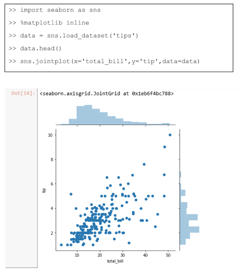
Kind parameter inside jointplot() shows the plots which are between the two distributed plots. Kind = ‘hex’ shows hexagonal representation which is similar to scatterplot representation. It turns the hexagonal darker as the number of points increases and lighter as it decreases.
Try this yourself : play around with different values of kind (“scatter” | “reg” | “resid” | “kde” | “hex”).
Pairplot
Pairplot shows the relationship between two variables like Jointplot. The difference is that Jointplot shows all possible combinations of columns present in the dataset. Pairplot shows only the columns which hold numerical values.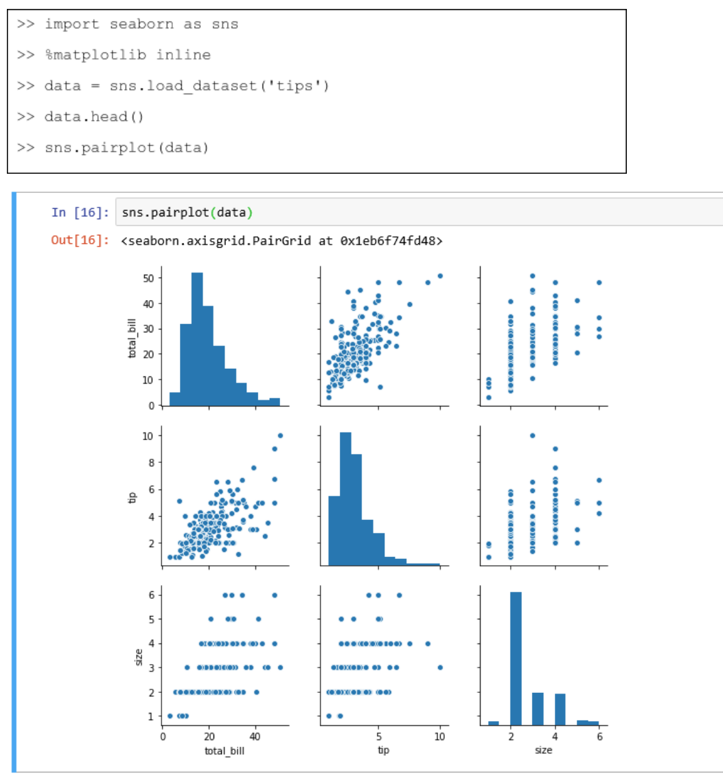
If your dataset is large it might take longer to appear.
Hue argument inside pairplot() input as column name which contains string categorical values like male-female , kid-teen-adult, or Indian - foreign and it colors the data points according to the column name which is passed in for hue.
There is one more argument palette inside pairplot() which maps the color of the plot according to the hue variable.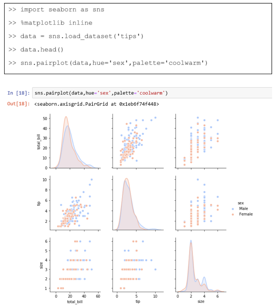
Rugplots
Rugplot simply draws a small line for every plot in the distribution.
Categorical Plots
Categorical plots are used to visualize relations which involve categorical data.
Barplot
This is a kind of general plot which aggregates the categorical data based on some function, by default with mean or average.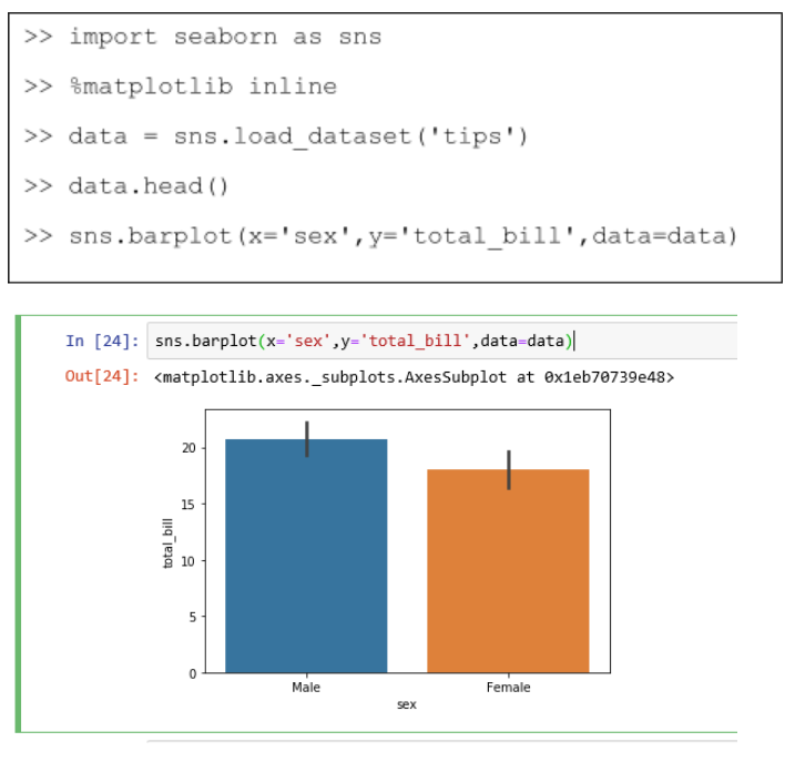
You can use estimator argument inside barplot() to use your own function.
Countplot
Countplot is the same as barplot but we have to set the x value only. The y value is automatically chosen.
Boxplot
Boxplot facilitates comparison between variables by showing the distribution of quantitative data.
Go through the reference: https://seaborn.pydata.org/generated/seaborn.boxplot.html for in-depth operations you can do with boxplot.
Stripplot
This shows scatterplot based on categories.
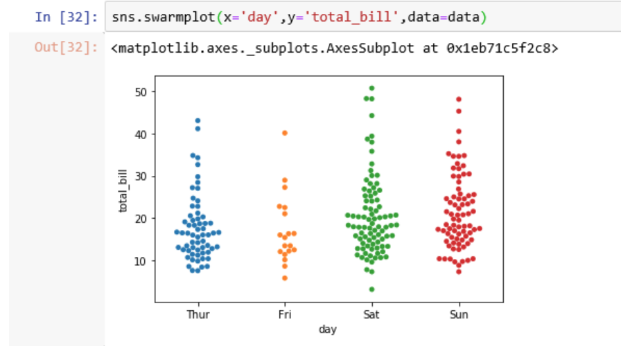
Swarmplot
Swarmplot is similar to stripplot. The only difference is that points are plotted in such a way that they don’t overlap for a better view.